POLIPILL | MEDICATION MANAGEMENT APP
CONTEXT
Postgraduate diploma project
RESPONSIBILITIES
User Research
Competitive analysis
User interviews
Empathy Maps
Personas
User journeys
Mockups
Usability testing
YEAR
2023
Overview & Problem area
PoliPill is a mobile app designed to support users in managing their medication routines by offering personalized reminders, intake tracking, and educational resources. It integrates with multiple wearable devices and allows multiple users to manage an account, providing flexibility and convenience.
The app addresses the issue of medication non-adherence, a common problem that persists despite technological advances, where many still rely on paper, SMS, and email for medication management. By improving adherence, PoliPill aims to prevent health complications and enhance communication between patients, caregivers, pharmacists, and doctors.
Methodology: Design Thinking
Userflow
Wireframes
Mockups
Prototype
Problem Statement
Personas
User Scenarios
Research
Competitor Analysis
User Interviews
Empathy Map
Usability tests
Research | Global Medication-taking rates
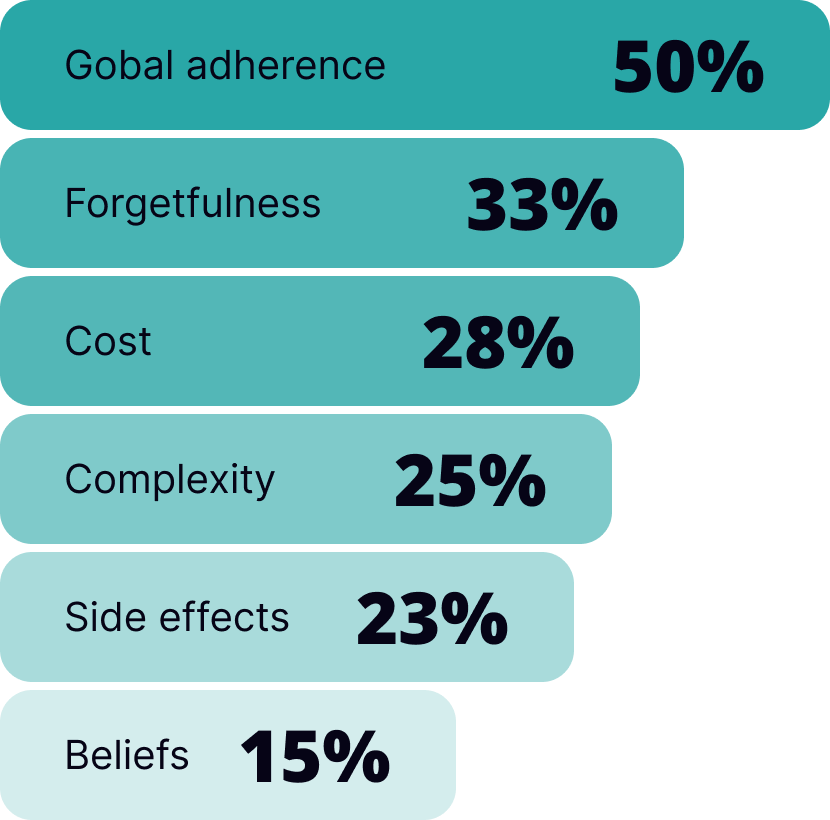
Medication compliance among patients with chronic diseases averages around 50%. This issue is expected to grow as the global burden of chronic diseases rises. Factors affecting whether patients follow their prescribed treatments range from forgetfulness to personal beliefs.
Not following medication instructions properly is linked to worsening health conditions, increased hospitalizations, and higher mortality rates.
30 - 40% Medication adherence for blood pressure
40 - 70% Medication adherence for depression
28% Maintenance medication adherence for asthma
Competitor Analysis
User Interviews
To better understand the complexities of medication management and identify viable solutions, we conducted interviews with a diverse array of stakeholders. This group consisted of:
two pharmacists,
two physicians,
two individuals suffering from chronic disease,
one elderly user,
one young user.
During interviews with participants, key issues identified included confusion with multiple medications, fear of side effects, and inconsistent reminders. Users expressed a strong need for a simple interface with clear alerts. These findings directly influenced the design of a streamlined dashboard and customizable notification system.
Insights: reasons for not taking medicines
Empathy Maps
Empathy maps revealed that users felt overwhelmed and anxious about managing medications. Key insights included: ‘I’m scared I’ll forget a dose,’ and ‘It’s hard to understand my treatment plan.’ These emotions informed our decision to include visual treatment timelines and an easy-to-read medication guide, providing reassurance and clarity.
This empathy map is based on interviews conducted with two doctors and highlights patient struggles with medication adherence. Patients often forget doses, misunderstand instructions, or find schedules too complex. Emotional barriers like fear of side effects and skepticism add to the challenge. To achieve the goal of improving adherence, doctors suggest clear communication, emotional support, and practical tools.
Says
“Apps are the future, if from a download, a doctor can access all information.”
“It's important to be accompanied by someone who is healthy and capable.”
“There are a lot of intoxication due to mistakes using pillboxes.”
Does
Reduces technical terms.
Explains how the medications is going to help.
Explains the possible side effects, so that patients are not caught by surprise and abandon the treatment.
Uses a patient oriented approach.
Thinks
“How can I explain things clearly in a way that is understandable to both literate and less literate patients?”
“It's almost impossible to check the patient's compliance to medication after an emergency episode.”
Feels
It is hard for some patient to understand why a medicine/dosage are being prescribed.
Difficulty in checking adherence to meds.
It is easy to get the patient to take medication when they are looking for something to relieve pain or illness.
This empathy map derives from patient interviews and reveals diverse challenges with medication adherence, including reluctance due to perceived "chemical" nature, embarrassment or financial constraints. Chronic patients typically adhere well but may forget during changes, while occasional patients struggle due to lack of habit. Confusion about pill purposes, frustration with similar medications, and reliance on memory are common issues.
Says
“In a weaning situation it is hard to follow the treatment instructions.”
“It is annoying the amount of pharmaceuticals making the same pills.“
“Sometimes people memorise the brand instead of the name of the medication.”
Does
Chronic patients sometimes forget to take the meds when their routine changes.
Occasional patients forget to take their meds because they are not used to.
Some patients do not take their meds because they can’t afford them.
Thinks
“If symptoms disappear I will probably stop taking medication.”
“If I don’t feel any improvement after starting the meds, I might stop taking them.”
“Sometimes I don’t even know what each pill is for.”
Feels
Reluctant to take “chemical” medication.
Chronic patients feel no difficulty taking medication due to established routine.
Embarrassment to show medication they take.
Problem Statement
Current medication management tools are often confusing, leading to missed doses and improper adherence. Users struggle with complex schedules, lack of reminders, and difficulty tracking progress. This project aims to create a user-friendly app that simplifies these tasks, ensuring users can manage their medications effectively and improve their health outcomes.
Personas
Sebastião is a dedicated teacher and the main caregiver for his mother who has chronic health issues. Balancing these roles has been a challenged and deepened his appreciation for effective health management and technology that simplifies daily life.
SEBASTIÃO
Age 37 | Occupation Primary school teacher | Caregiver
Education Master’s Degree | Location Porto, Portugal
“I like routines and schedules. They help me stay organized and efficient, but I am struggling to find an effective strategy to care for my mom’s medical conditions in the best way possible.”
Goals
Provide the best possible care for his mother, ensuring she takes her medications on time.
Achieve a healthy balance between being a caregiver and a teacher.
Pain Points
Keeping track of his mother's complex medication regimen.
Struggles to find time for his personal interests.
Behaviours
Actively seeks out and adopts new technologies.
Follows a structured daily routine to manage his teaching responsibilities and caregiving duties efficiently.
Antónia is Sebastião's mother. She remains lucid and takes pride in managing her own affairs, but as her health has declined, she has come to rely more on her son. Her health issues require a complex medication regimen, which can be confusing and challenging to keep up with.
ANTÓNIA
Age 74 | Occupation Retired housemaid
Health situation Chronic patient | Location Porto, Portugal
“I don’t want to bother my son with this. I’ve been managing fine for years, but every now and then, I slip up.”
Goals
Take her medications on time to manage her health well.
Understand better her health conditions and the medications she is taking.
Be independent, seeking assistance only when absolutely necessary.
Pain Points
Sometimes misinterprets the schedule, leading to missed or incorrect doses.
Understanding medical instructions and navigating the healthcare system.
Sees the benefits but finds it hard to adapt to new technologies.
Behaviours
Uses written notes to keep track of medications & appointments.
Keeps open communication with her son about her health & any challenges she faces.
User Journey Map
An episode about a routine doctor's appointment in the life of a chronic patient and her caregiver.
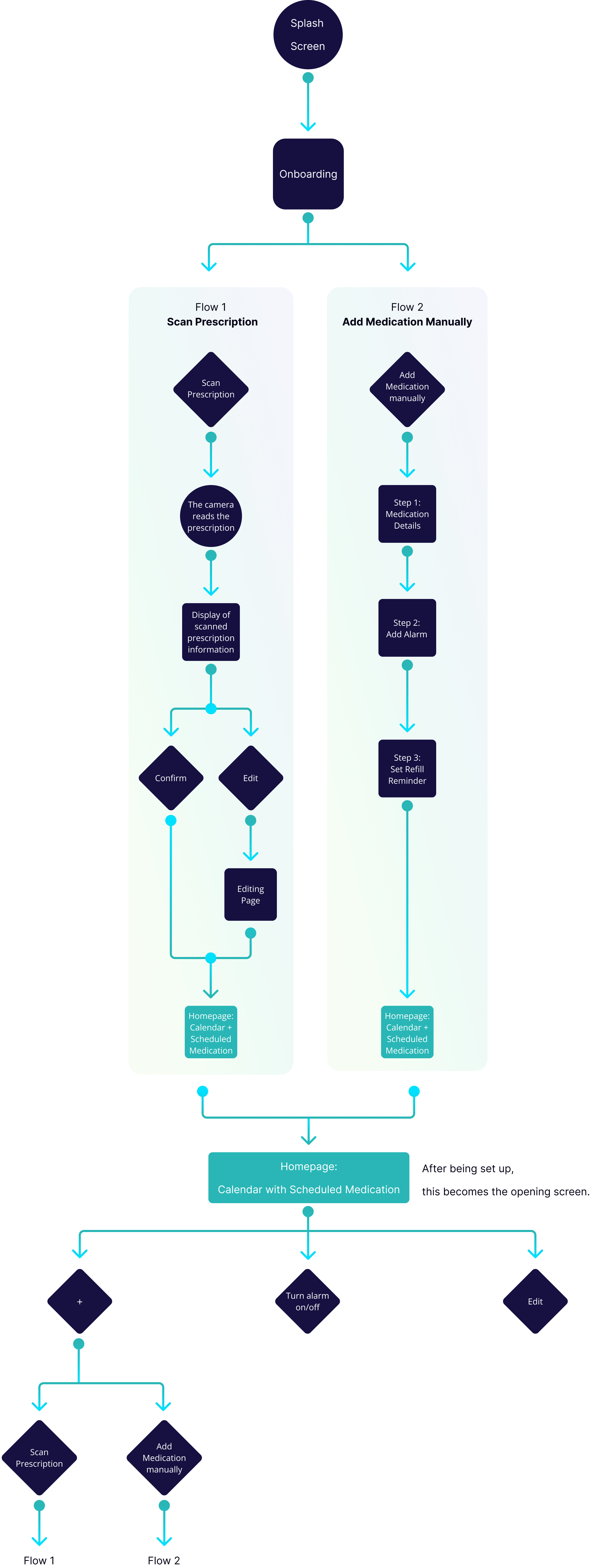
User flow
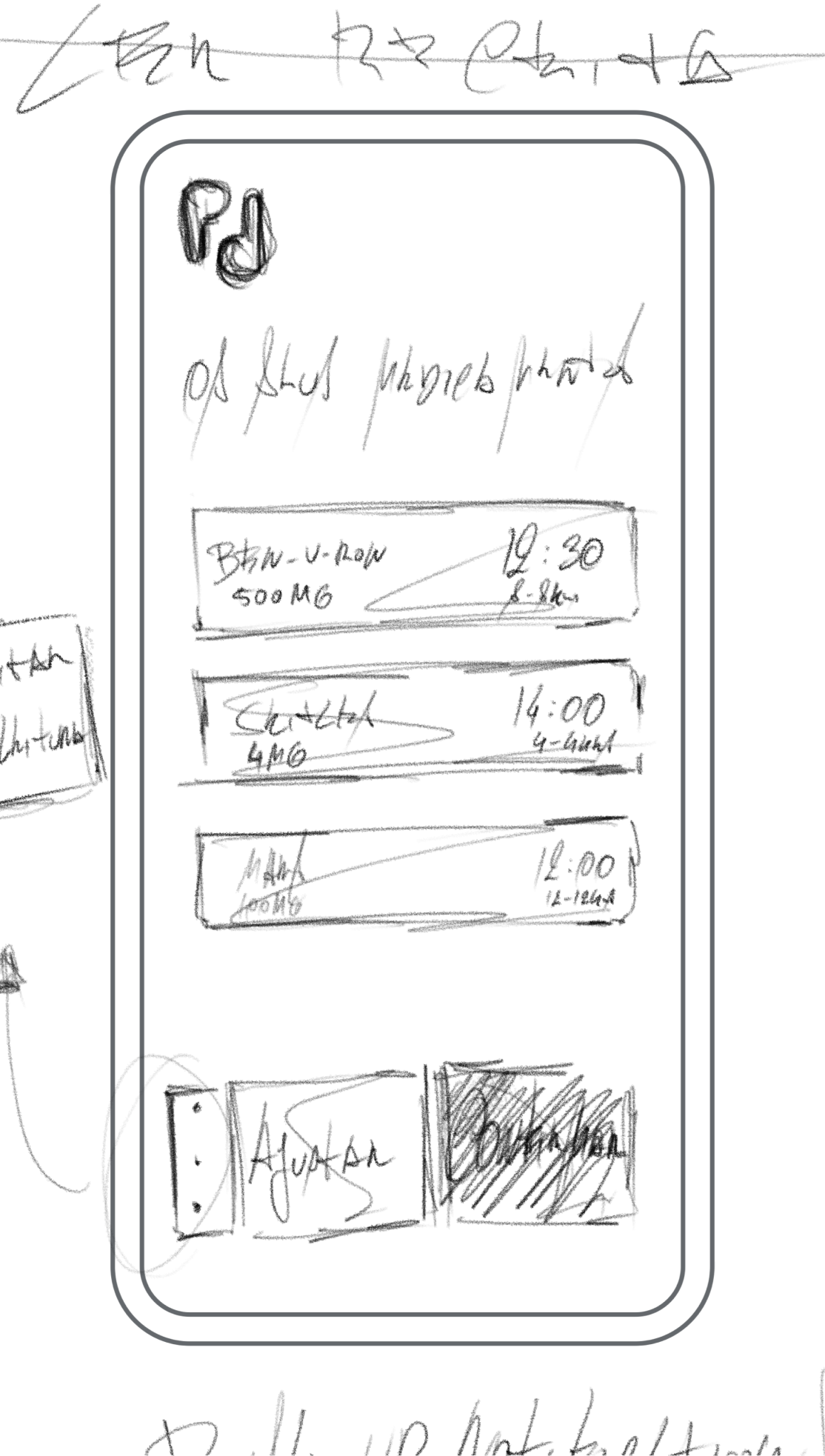
UI Iterations
Key moments
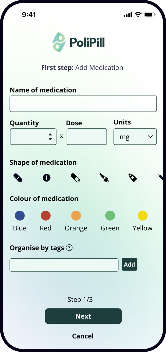
The app simplifies prescription input. By scanning a code, the prescription, along with medication details and dosing times, is automatically added. If there's just one medication, you can scan its box. You can manually input medication details through guided steps.
Easy prescription input:
Scan, Box Recognition or Manual Entry
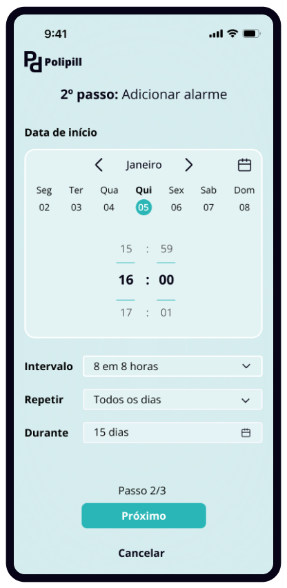
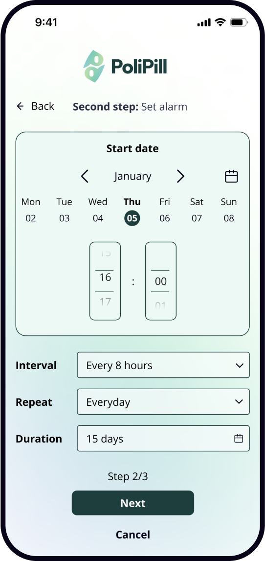
The app notifies users to take medication at scheduled times, creating schedules based on dosage intervals (e.g., every 8 or 12 hours) and adjusting according to user dosing habits through AI. Additionally, it sets alarms for low medication levels, reminding users the need to refill.
Automatic alarms
Easily track daily prescribed medications and their intake times. Quickly edit medication details or toggle alarms on and off. Once the first medication is added, this becomes the main screen. Use the "+" button to easily add more medications if needed.
Medication calendar
Usability tests | Unmoderated tests
Users focused on screen information and guidelines, providing written comments on its relevance. The results provide clear and actionable feedback. The recommendations offer concrete directions for improvement, and the identification of the most and least relevant information helps to prioritize what content should be emphasized or downplayed in the user interface.
Data
Number of participantes: 35
Task completion: 100%
Average time on task: 1m25s
Recommendations
Register previous doses
Improve graphics and communication
Reduce the interval to 5-minute increments
Most relevant information
Dosage
Medication name
Least relevant information
Shape of the pill
Colour of the pill
Usability tests | Moderated tests
Users navigated both functions while communicating their experience via guided instructions by a moderator, following a think-aloud protocol with subsequent inquiry to identify areas for enhancement. The goals were to assess task completion, to test functionalities and workflow and check the relevance of the copy.
INSIGHTS
MARIA
Age 59
Occupation Baker
Education 4th grade
Location Viseu, Portugal
“I find it easier to write things down and use a paper calendar. The automatic scan felt like magic but was a bit confusing for me. I’d appreciate clearer instructions.”
RAFAELA
Age 38
Occupation Pharmacist
Education Bachelor’s Degree
Location Lisbon, Portugal
“The color confusion between pills and the package is something that definitely needs addressing for better clarity.”
LARA
Age 32
Occupation Product Designer
Education Bachelor’s Degree
Location Braga, Portugal
“I like the automatic features, but there’s room for improvement in terms of clarity and functionality. Expanding medication forms and revising the copy will enhance the overall user experience.”
FRANCISCO
Age 33
Occupation Fulfilment Manager
Education Bachelor’s Degree
Location Ovar, Portugal
“Automation is great, but when it fails or isn’t clear, it becomes frustrating. Ensuring the system works seamlessly and improves clarity will make it more effective.”
Flow: Scan Prescription
Flow: Scan Medication
Flow: Scan Medication
Usability tests | Preference test
12 users compared two different screen designs and chose the one they found more appealing and intuitive. The goal was to assess the intuitiveness of the interface design and copy. The results indicate a compelling preference for screen A.
Option B: 17%
Option A: 83%
Key differences between screens:
UI: How to select the beginning of the treatment (calendar appearance)
UX: Information hierarchy
Copy: Example “Duration” or “End date”
Changes
After conducting several usability tests, we carefully analysed the feedback and integrated the insights into a new iteration of our design.
Removing unnecessary labels and redundant edit menus;
Eliminating toggles that cluttered the user experience
Adjusting the copy for clarity;
Introducing pill-shaped buttons, accompanied by clear color names to enhance accessibility;
Redesigning the calendar to be more intuitive, with uniform positioning across all screens;
Improving the layout to prioritise user interactions;
Adjusting the position of key fields for better navigation;
Revising the dock menu;
Emphasising time selection over toggles;
Making the overall design more user-friendly and efficient.
Deleted Tags
Deleted General Edit
Deteled Toggles
Copy adjustment
More pill shapes addes
Colours in text added
Calendar redesign for intuitiveness
Time with priority over toggle
Calendar redesign for intuitiveness
Copy adjustment
Fields repositioned
What I would do differently
If I were to approach the case study again, I would refine the problem statement to focus more on specific user pain points and how the app uniquely addresses them. Enhancing the User Journey Map with detailed emotional insights and decision points would make it easier to empathize with users' challenges. Simplifying the User Flow to better cater to diverse needs and providing a deeper, actionable analysis of usability tests would also be a priority.


