Norman Doors, Meet My Elevator: Where Mapping Goes to Die

For those who might not be familiar with the concept, Norman doors were introduced by designer Don Norman to illustrate poorly designed doors that confuse users about how to operate them.
Probably like most UX designers, I keep looking around for other versions of this problem, where design in everyday objects offers us very frustrating experiences. Norman doors serve as a reminder for designers to create clear, user-friendly products that meet users' expectations and experiences.
I am now realizing that I decided to study UX/UI shortly after moving to my current home, and that maybe, unconsciously, the reason was my new elevator. It’s an odd interface, right?
Now, I will be using some of Don Norman’s principles from The Design of Everyday Things (Norman, 2013), to comment on my elevator's interface panel. You don’t need to be a designer to see the usability shortcomings of this panel. It follows no logic and is particularly bad in terms of mapping. In this text, I will discuss several concepts, including affordances, visibility, mapping, mental models, and cognitive load. Definitions of these concepts are provided at the end of the article.
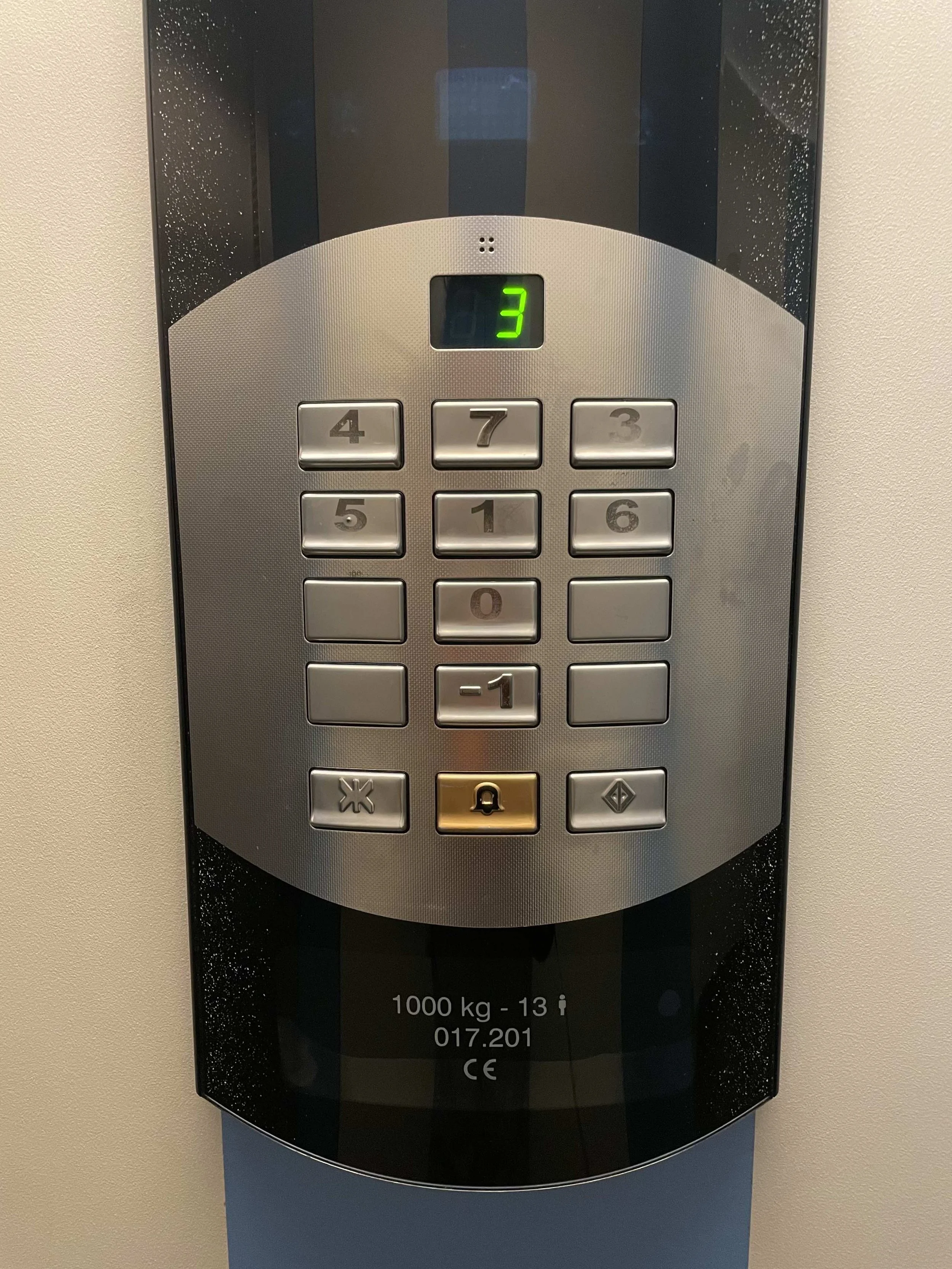
The panel provides clear affordances in some areas. The buttons with numbers on them suggest they are meant to select a floor, which is what we, as users, expect. Some flat, empty buttons suggest they are not in use. The bell icon also provides an affordance, signaling that it is to be used in case of emergencies. This is how we can easily infer a button’s purpose through design cues.
The visibility of the numbered buttons is good; the numbers are large and easy to read, and there is a display that provides feedback about the current floor. However, the icons for special functions, such as the button next to the bell, are more abstract. The arrows, which indicate opening or closing the doors, have become a standard in elevators, but I would say they are a learned convention, not an inherent affordance. This might introduce ambiguity for users unfamiliar with the system. These symbols lack clarity, making users to either guess or learn through trial and error, which ia not very intuitive.
The most significant issue here is the button mapping. The numbers are arranged randomly. In an interface with three buttons per row, users would typically expect the floors to be organized from left to right and bottom to top, aligning with a natural mapping that suggests upward or downward movement. A layout like this would better match most people’s mental models of numerical order. Instead, we have this unusual layout.
The poor button arrangement introduces unnecessary cognitive load and goes against the ideal of user-centered, intuitive design. Reconfiguring the button layout to match users' mental models would easily improve usability and overall user experience.
While it may be funny, it exemplifies a poor design choice (or perhaps an installation issue) that forces users to consciously look for the correct button, often after mistakenly pressing the wrong one. This introduces unnecessary complexity and almost turns into a meme of bad user experience.
In conclusion, my elevator’s panel demonstrates how poor mapping, unclear affordances, and high cognitive load can disrupt a user's experience with an everyday interface. By considering user expectations and mental models in design, we can create systems that feel intuitive and require minimal effort to use. This elevator serves as a reminder of the impact even small design decisions can have on our daily lives.
Learn the concepts
Mapping refers to the relationship between controls and the actions they perform. Good mapping means the layout and operation controls are logically related to their intended actions. For example, the arrow keys on a keyboard: when you press an arrow, you expect movement in the direction the arrow is pointing to. Effective mapping helps users understand how to interact with an object without confusion.
Visibility is about making important elements of a. design easy to see, so that users can quickly understand what they can do and how. When actions are visible and clear, users are less likely to make mistakes. For example, car dashboards use alarm lights, symbols, and sounds to provide feedback, such as reminders to fasten seatbelts.
Affordances suggest how an object can be used. They can be perceptible or hidden. A perceptible affordance would be the buttons on a remote control, which clearly look like they can be pressed. Hidden affordances are implicit and only become evident when an action is taken. For example, voice commands, such as Siri on AirPods, are hidden affordances.
Mental models are representations we create in our minds of how things work in the real world. They help us predict the behaviors and outcomes of certain actions. For instance, when we flip a light switch up, we expect the light to turn on, and when we flip it down, we expect it to turn off. When this doesn’t happen, we become frustrated and confused.
Cognitive load refers to the mental effort required to process information, learn something new, or complete a task. In design, the goal is to offer intuitive products so that the cognitive load of interaction is reduced, avoiding user frustration and annoyance.